Museum of random memory
The exhibition:
*Based in Aarhus, Denmark
* The idea of creating the museum was sparked when a group of individuals from Aarhus University were a part of a project called 'Creating Future Memories'.
* They wanted to explore what our daily routines connected to social media and sorting our data meant for the way we shape our memories, and therefore the traces of future memories
*Guests and “canvassed” participants were invited to share random ‘matters’ – a random idea, a random image from their smartphone or a random object they had on them.
*The Museum was built around a participatory design. They wanted to engage people from the conference and visitors at DOKK1 in building the exhibition and curating the content of the exhibition. Equipped with rudimentary collector badges they sought out participants and asked for a random idea, a random photo or a random object.
The thing that interested me and attracted me the most to the Museum of Random Memory is the fact that my room resembles it in a way. I call myself a memories hoarder because I tend to keep everything that I feel even the slightest bit of sentimental towards. I have dozens of old wallets full of receipts from things that I have bought abroad, business cards of restaurants that I visited or a ticket to a movie that I saw 6 years ago. As a child I used to collect candy wrapping so I guess this rubbed off on me as an adult also. I feel a sense of guilt throwing away any object that I connect to a certain memory or a place, an object that to anybody else is just a receipt or just a cloakroom token.
Pamela Georgieva / Couldbeworse
Making and Curating
Delfina Foundation / Geumhyung Jeong - Private Collection: Unperformed Objects
What was the exhibition about:
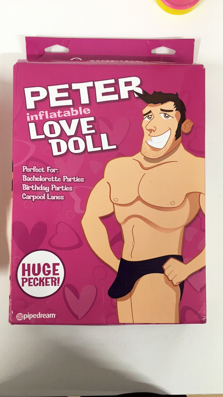
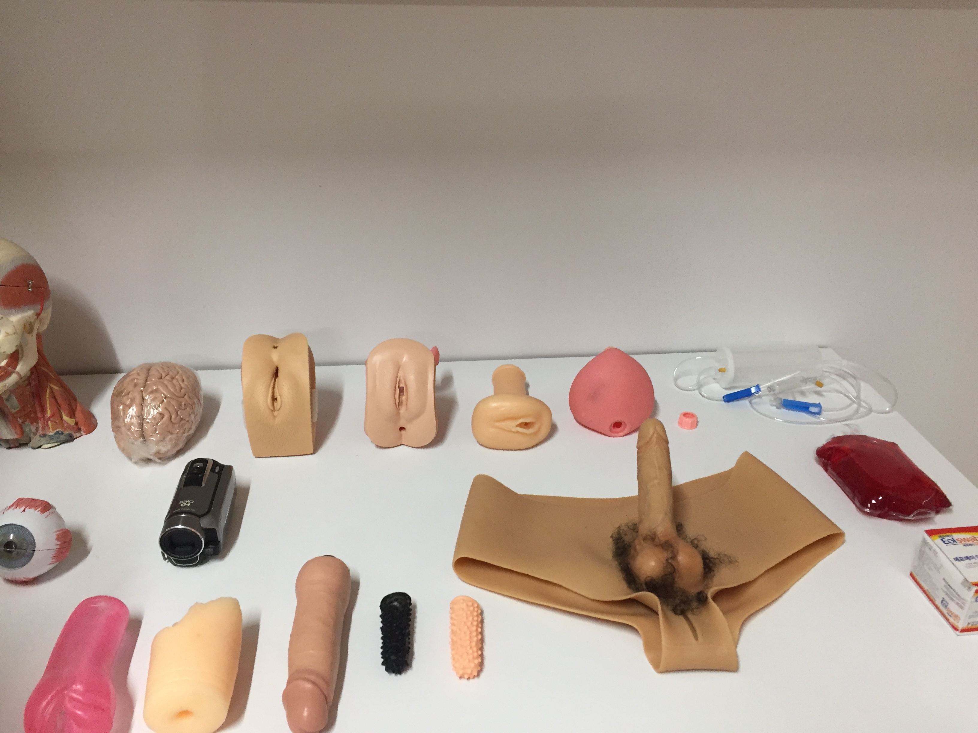
A collection of plain everyday objects upon which she bestows a bizarre, disconcerting life through an intense and risky interaction with her own body to challenge notions of sexuality, technology, and the female body.
Jeong has selected ‘unperformed objects’ - mannequins, vacuum cleaners, training machines and medical apparatus with a latent potential. The exhibition brings the narrative of these objects themselves into play, alongside decision-making and failure in the process of making performances.
Video monitors show clips of the ‘performed objects’ not present, those modified by Jeong and activated in durational performances where they are first used in intended and routine ways before Jeong’s movements morph into erotic, obsessive, or antagonistic actions.
Even though the exhibition was not exactly what I am used to I appreciated the thought that has gone into collecting each and every one of the objects.For me the exhibition represented associations. Each of the objects in the room could have meant something on their own but they got a whole another meaning when put together with other objects. For example, the clearest association for me was the eye and the camera next to it, the lens of the camera seen as a digital eye.
Do Artifacts Have Politics? By Langdon Winner
Important points:
*'It is no surprise to learn that technical systems of various kinds are deeply
interwoven in the conditions of modern politics. The physical arrangements of
industrial production, warfare, communications, and the like have fundamentally changed the exercise of power and the experience of citizenship.'
*'But the corrective has its own shortcomings; taken literally, it suggests that technical things do not matter at all. Once one has done the detective work
necessary to reveal the social origins?power holders behind a particular in
instance of technological change?one will have explained everything of importance.'
*'Histories of architecture, city planning, and public works contain many examples of physical arrangements that contain explicit or implicit political purposes. One can point to Baron Haussmann's broad Parisian thoroughfares,
engineered at Louis Napoleon's direction to prevent any recurrence of street fighting of the kind that took place during the revolution of 1848. '
The Power of Display by Mary Anne Staniszewski
Overview of the book
"Art historians, traditionally, have implicitly accepted the autonomy of the artwork and ignored what Mary Anne Staniszewski calls "the power of display". In this examination of installation design as an aesthetic medium and cultural practice, Staniszewksi offers a history of exhibitions at the most powerful and influential modern art museum - The Museum of Modern Art in New York. Focusing on over 200 photographs of the visually rich but overlooked history of exhibition, Staniszewski documents and deciphers an essential chapter of 20th-century art and culture and provides a historical and theoretical framework for a primary area of contemporary aesthetic practice - installation-based art."
In the chapter, Staniszewski looks at creating installations for aesthetic autonomy, and specifically Alfred Barr's exhibition technique. Barr did not select the most famous paintings for an inaugural exhibition in the Museum of Modern Arts, but as a director, he did install them. Through his experience, he has managed to explain that "hanging pictures is very difficult", he goes further to explain "I feel like I am just entering the second stage of hanging when I can experiment with asymmetry. Heretofore I followed perfectly conventional methods, alternating light and dark, vertical and horizontal."
Moreover, the chapter looks at Beaumont Newhall, who was hired as the museum's librarian in 1935. He then later went on to serve as a photography director. Newhall helped Barr install the famous exhibition Vincent Van Gogh, he recalls and emphasizes on Barr's exhibition technique:
"The Van Gogh exhibition, like so many of Alfred shows, was more than a superb loan collection. The pictures were not hung symmetrically by size, with the largest in the middle of the wall, the next largest at the ends and the smallest in between, as in most museums at the time. No pictures were hung in logical sequence, depending on style and period, well spaced so the did not impinge one another and with explanatory labels."
‘Mapping International Exhibitions’ by Ferguson and Greenberg
Overview
"An anthology of writings on exhibition practice from artists, critics, curators and art historians plus artist-curators. It addresses the contradictions posed by museum and gallery sited exhibitions, as well as investigating the challenge of staging art presentations, displays or performances, in settings outside of traditional museum or gallery locales."
The article discusses the exhibitions as a map, and the strategies used as well as the techniques that are used in different exhibitions and how they came about.
Important points from the article 'Mapping Internal Exhibitions' exhibition strategies:
(John Tagg: JOHN TAGG is Associate Professor of English at Palomar College in San Macros, California. He is coauthor, with Robert B. Barr, of "From Teaching to Learning: A New Paradigm for Undergraduate Education" (Change, 1995). For the past several years, he has conducted workshops and made presentations at many colleges and universities or organizational transformation and the Learning Paradigm.)
* A mapping metaphor by John Tagg has been used a lot within the post-modern writing, especially writing about art. He says that "Every exhibition is a map. At such, it not only separates, defines and describes a certain terrain, marking out its salient features and significant points, omitting and simplifying others, but it also depicts the ground according to a method of projection...."
Furthermore, the articles discusses exhibitions as maps, because the position of an exhibitions relates strongly to the political affairs happening in the given geographical location. For example, if there are political issues happening in a certain country and an exhibition that does not necessarily relate to it, might be read differently by the viewer, because of the state of affairs and their views of the world at the given time.
"One of the strategies is the link between the location of the exhibition and its politics. Where an exhibition is staged, particularly an international exhibition is a key determinant which artists are included as participants and the exhibitions likely range of viewers."
Terry Smith, “What is Contemporary Curatorial Thought?” in Thinking Contemporary Curating, New York: Independent Curators International, 2012, pp. 27-55.
Book overview:
"What is contemporary curatorial thought? Current discourse on the topic is heating up with a new cocktail of bold ideas and ethical imperatives. These include cooperative curating, especially with artists; the reimagination of museums; curating as knowledge production; the historicization of exhibition-making; and commitment to extra-artworld participatory activism. Less obvious, but increasingly of concern, are issues such as rethinking spectatorship, engaging viewers as co-curators and the challenge of curating contemporaneity itself. In these five essays, art historian and theorist Terry Smith surveys the international landscape of current thinking by curators; explores a number of exhibitions that show contemporaneity in recent, present and past art; describes the enormous growth worldwide of exhibition infrastructure and the instability that haunts it; re-examines the contribution of artist-curators and questions the rise of curators utilizing artistic strategies; and, finally, assesses a number of key tendencies in curating as responses to contemporary conditions."
The chapter looks at the usage of the term contemporary and how it relates to art, in more detail the contemporaneity, and if our current condition is asking for art curatorship.
Smith puts a highlight on the fact that "the first step is to recognize that the object of contemporary curating is much larger than contemporary art.".
The chapter gives us a deeper and clearer understanding of curating as a profession, which especially helped me understand it better as I have never come across the profession before entering the course and learning more about it. Smith describes it as "one that proffers art and offers fresh work or a fresh presentation of known work".
Stuart Hall Visit
I found this video on Youtube of Terry Smith's book launch. He goes to explain deeper the thought behind the book, as well as answer questions regarding it.
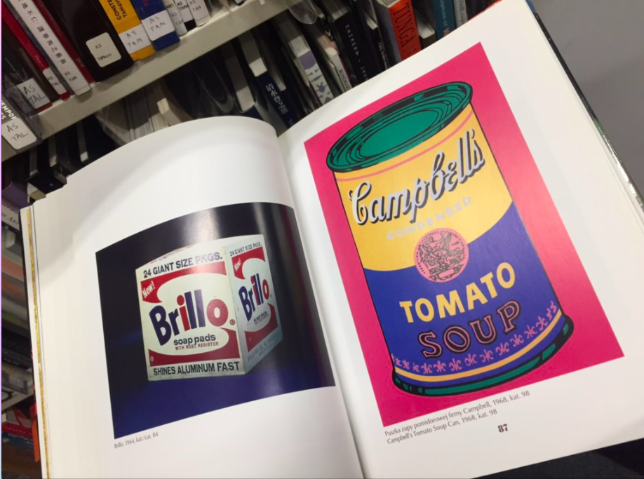

The Stuart Hall Library was very different to any other library I have seen. Most libraries that I have been to have been organised by genre, or alphabetically all thoughout the library, however in contrast Stuart Hall had various organisational methods. The one that fascinated me the most was the organisation by country.
Moreover the fact that they have managed to have such broad selection of books in a such small space surprised me a lot, as I come from relatively small country and managed to find quite a few books about it, as well as one called "On human diversity" by a famous bulgarian-french writer, who passed away recently so it felt great to randomly discover some of his work.
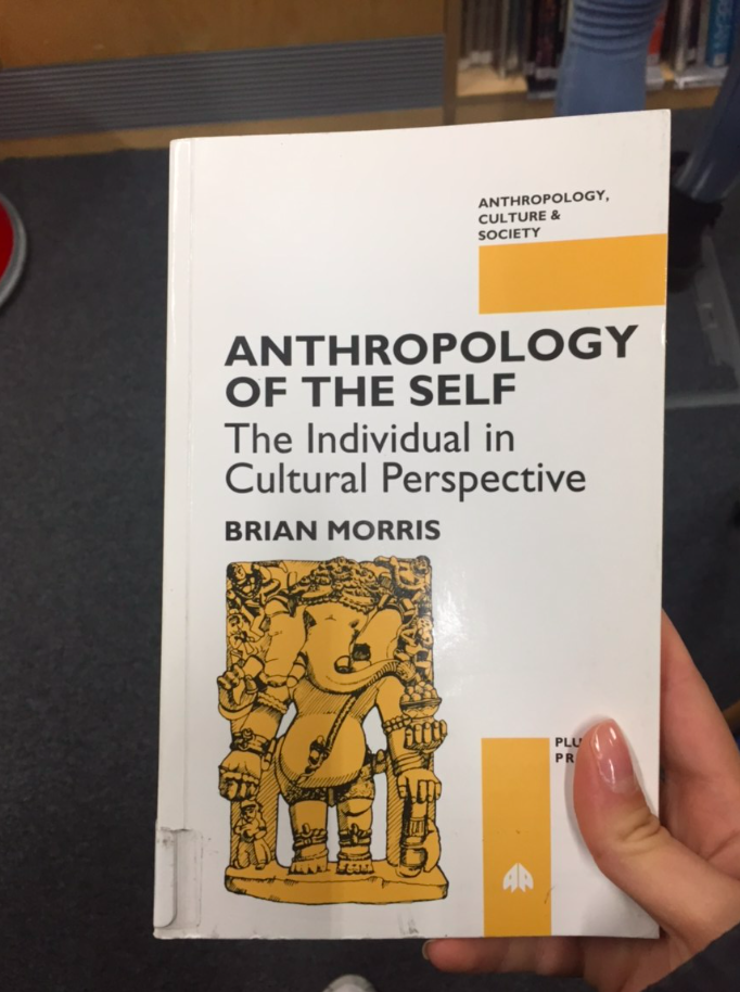
Furthermore I found a book called "Anthropology of the self", that interested me as I had recently searched for an anthropology book after finding it quite interesting following an essay that I did in one of my modules last year called Visual Culture. Semiotics was my favourite aspect of it and whilst researching semiotics, I discovered that I can delve deeper into it by exploring anthropology, modern as well as ancient.
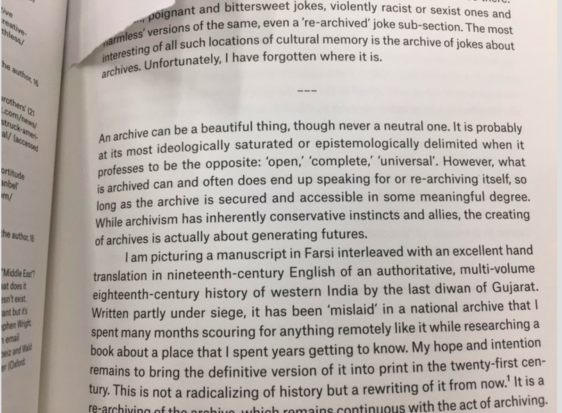
Additionally as I was looking through the pages of one of the books that I randomly picked up I came across a great paragraph about archives, just when I was trying to put the concept into perpective. It read:
"An archive can be a beautiful thing, though never a neutral one. It is probably at its most ideologically saturated or epistemologically delimited when it professes to be the opposite: 'open', 'complete', 'universal'. However, what is archived can and often does end up speaking for or re-archiving itself, so long as the archive is secured and accessible in some meaningul degree. While archivism has inherently conservative instincts and allies, the creating of archives is actually about generating futures."
How to research workshop with Elena
The research workshop with Elena was particularly useful, as we haven't had that much practice researching in groups before, and putting something together quite quickly, having to be creative with our presenting skills.
It was also interesting to see how each and every one of the groups took a different approach to presenting their findings, some did powerpoints, we chose to present it in hotglue.
Moreover, I learned that researching is not only looking up what you need to research word by word, you have to also interpret it and think further about it, what connects to it, what might have a similar meaning to it. That will give you research findings that have depth and are interesting.
‘Art as Anthropology’ in Art, Anthropology and the Gift by Roger Sansi pp. 20-45.
I found the book very interesting as I have stated before, after my Stuart Hall Libary visit, I find anthropology very interesting. The look helped me understand both concepts better and how they relate to each other.
The chapter 'Art as Anthropology' looks at the relationship between art and anthropology and the journey that both these concepts had to go on to reinvent themselves and create something new. The chapter goes into a deeper explanation of what artist and surrealist to in order to elaborate the concepts.
Important points from the chapter:
What did artists do?
The artist took on to a whole new concept: taking the world around them and turning it into art, calling it "the everyday life". They turned their surroundings into their new laboratory. Many debates, problems, and questions emerged surrounding that.
Further reading from the chapter: 'The predicament of culture' (1988) by James Clifford
What does an anthropologist/surrealist do?
"If the task of the anthropologist is to describe the exotic as familiar, and show how strange and exotic rituals and beliefs are part of everyday life for people in other parts of the world.
How did they explore it?
"From the perspective of this 'primitive' gaze one had to look at everyday life as if seeing it for the first time, as a marvelous and unexpected encounter. In 'everyday life' the surrealist met the 'objets trouvest' 'found objects'."
Alternative Art and Anthropology: Global Encounters edited by Arnd Schneider, ‘Ethnography, ‘pataphysics, copying’ by X. Andrade pp. 189-208
Book Overview:
"While the importance of the relationship between anthropology and contemporary art has long been recognized, the discussion has tended to be among scholars from North America, Europe, and Australia; until now, scholarship and experiences from other regions have been largely absent from the mainstream debate. Alternative Art and Anthropology: Global Encounters rectifies this by offering a ground-breaking new approach to the subject. Entirely dedicated to perspectives from Asia, Latin America, and Africa, the book advances our understanding of the connections between anthropology and contemporary art on a global scale. Across ten chapters, a range of anthropologists, artists, and curators from countries such as China, Japan, Indonesia, Bhutan, Nigeria, Chile, Ecuador, and the Philippines discuss encounters between anthropology and contemporary art from their points of view, presenting readers with new vantage points and perspectives. Arnd Schneider, a leading scholar in the field, draws together the various threads to provide readers with a clear conceptual and theoretical narrative. The first to map the relationship between anthropology and contemporary art from a global perspective, this is a key text for students and academics in areas such as anthropology, visual anthropology, anthropology of art, art history, and curatorial studies."
Unfortunately, I did not manage to find this book, online or in our university library.
9th October 2017 INDEPENDENT RESEARCH
V&A Museum of Childhood
Even though I had set my mind to do the Museum of random memory as my art project I decided to explore archives independently and see if I can find my own archive that will be different. I found online about the V&A Museum of Childhood a while ago and thought that it does actually sound like a relevant archive to me, an archive of our childhood, an archive of the changes the children went through throughout the years.
I found it fascinating how they have managed to preserve all of these toys and objects and create such accurate chronological archive, dating from the 1600s to current days.
17th October 2017 INDEPENDENT RESEARCH
Geffrye Museum
Following my visit to the V&A Museum of childhood, I decided to continue exploring independent ideas about my potential art project, either as a potential choice or archive or just as an inspiration. I went to the Geffrye Museum, which is based in Hoxton. To me, it is an archive. The museum is a long corridor, with space for walking and on the left side, you have a 'Timeline' of how the living rooms in Britain have changed over the decades. You have exact replicas of living rooms, exactly how they would be set from the 1600s to now. "The Geffrye explores the home from 1600 to the present day. Evocative displays of London living rooms and gardens illustrate homes and home life through the centuries, reflecting changes in society, behavior, style, and taste."
Having visited it, and realized it is actually an archive, I thought about choosing it as my art project for the final year exhibition. I am not completely 100% decided on it but I am exploring it as an option.
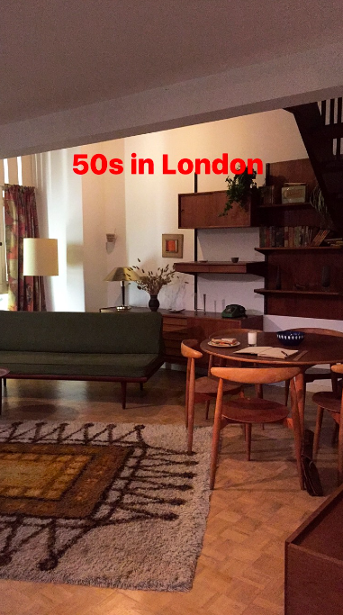
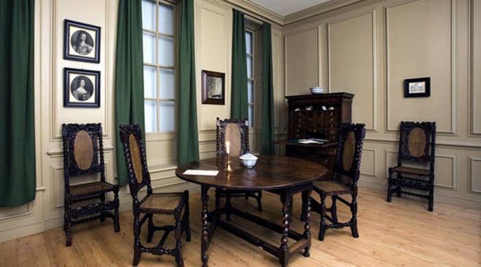
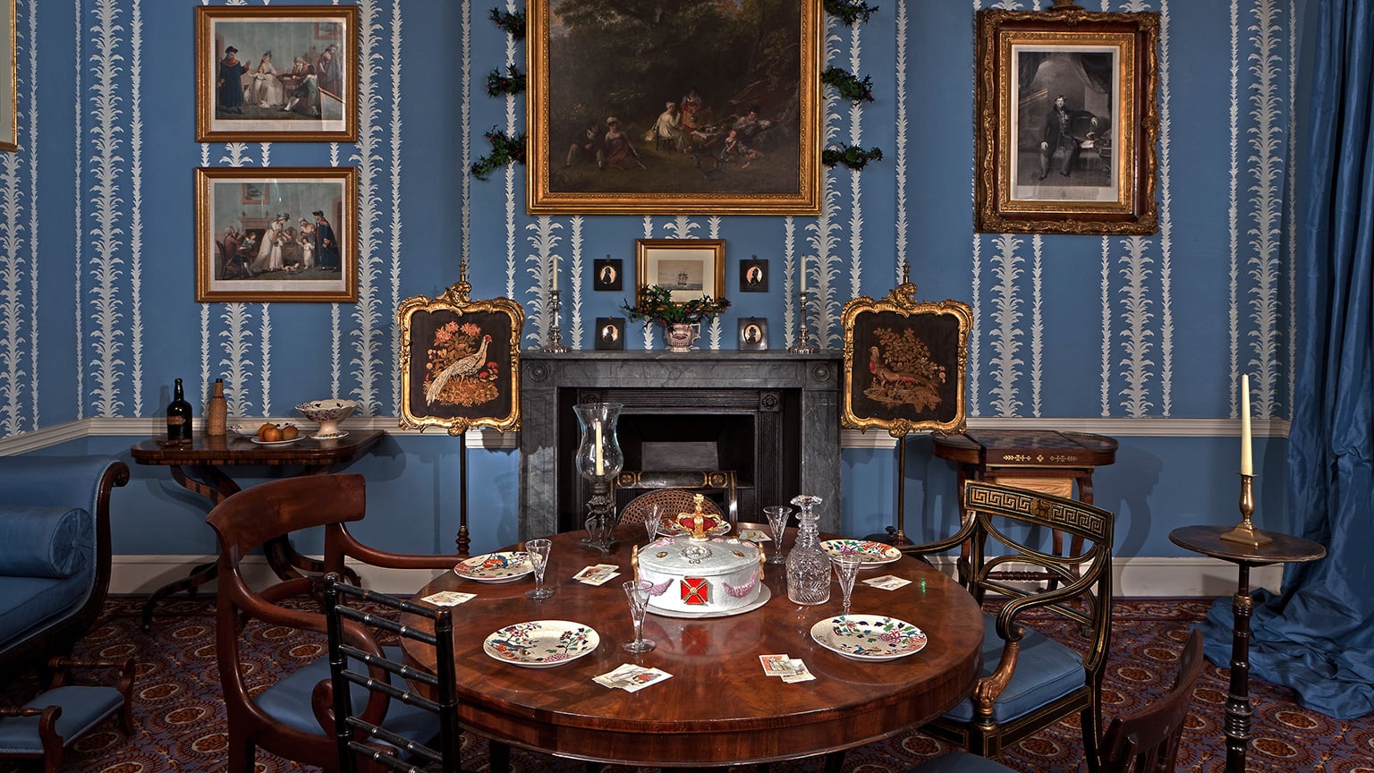
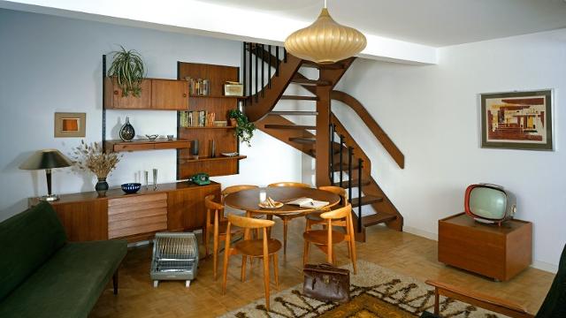
*Further exploring Geffrye Museum as possible choice of archive
When I started thinking about how they have arranged the museum, and how it gives u an exact idea of what their living rooms looked like, I started wondering and trying to imagine what the people living in such rooms were doing. How their days went, and how it has changed from now.
After wondering what they were doing in these living rooms, I started thinking about what objects they were using in their day to day life. For example today our most used object is our iPhone. We sit on the couch, we watch TV, but we are still using our iPhones and browsing the internet on them even whilst watching TV. For example, in the 1800s they did not have even TV. Instead, they were probably sitting on a couch reading books. Now to text we still use our iPhones. Then they had to write letters. All of this will show how our behavior. has changed over time
Whilst thinking about this I came up with a possible research question as well as art project based on the archive of rooms that Geffrye Museum has.
Research question: How have the everyday objects that we use in our living room changed over the last 150 years?
Artistic response project: Gather everyday objects from a living room: early 1800s and current time
I would gather objects and put them into two different sections, just as they have put the rooms in different sections around the museum. I would gather objects that people have used based on what the times were and objects that we now use based on what the times are now.
Brainstorming objects:
In the early 1800s, people did not text to each other on smartphones, they wrote letters to each other. To write and read letters, they used a variety of objects, such as a feather and an inkpot, a special knife-like instrument that they used to open letters with, pens that are used with inkpots before the rollerball pen existed.
People did not have televisions so they read books instead. With that come different accessories, like bookmarks, reading glasses and magnifiers.
Even though even now, people love drinking tea it was extremely popular in the 1800s. In Geffrye museum each and every one of the earlier rooms had a tea set on the table.
The living room has gone through significant changes over the past two centuries. in the 1800s the living room was not the most used room in the house as it is now. It was mostly used when entertaining guests.
Objects from current times: Now the living room is arguably the most used room in a family home. It is often used for dining, entertaining and just leisure. Families get together in the living room even if each and every one of them is doing something different. One family member might be browsing on their iPhone, another watching TV.
In our current times possibly the most used object in any room is the iPhone. And with the iPhone come different accessories for it laying around the living room.
In the 1800s many middle-class families had help around the house in the formes people who work for them and live in the house. They had maids and servants to help them with any chores. Now the newest addition to the family and the living room is Alexa (amazon device). It creates a shopping list for you, reminds you to feed the pet, can read the morning news for you and more.
Moreover an object that is in constant use in the living room is the TV and do to that we use remote controls.
Today a lot of living rooms have coffee tables, where you can find modern magazines and coffee table books.
Something that we now have in our living rooms, and people in the 1800s would not be able to even imagine we will have is the wifi router.
*The Fascinating History of the Living Room: https://www.builddirect.com/blog/the-fascinating-history-of-the-living-room/
*What is the origin of the term ‘living room’?: https://blogsurabhi.wordpress.com/2013/03/09/what-is-the-origin-of-the-term-living-room/
*Difference between Living Room and Drawing Room: http://www.differencebetween.info/difference-between-living-room-and-drawing-room
Important!: Re-read The Power of Display by Mary Anne Staniszewski to explore further ways of displaying the piece before the final year exhibition.
I will have two separate sections, perhaps like boxes with a missing front wall, that can kind of represent a living room, with 4 walls, but one missing so that we can see what is inside. One of the boxes will represent the living room objects and habits of the 1800s and the second one will represent the living room objects and habits of our current days. I will not have long explanatory label, just a small label on which it will say 1800s and current day. This way the viewer will be able to understand which eras im indicating, however they will have to make the connection for themselves: see the difference in the objects, understand where they come from and realise how much our behaviour has changed over the past decades.
GEFFRYE MUSEUM AS POSSIBLE ART PROJECT AND RESEARCH QUESTION
Further readings relating to this
Modes of presentation
November 2017 INDEPENDENT RESEARCH
Wellcome Trust / Wellcome Collection FINAL PROJECT
Whilst exploring further options for possible archives that I can base my end of year project I discovered the Welcome Trust and in particular the Welcome Collection.
"Wellcome Collection is part of the Wellcome Trust, founded by Sir Henry Solomon Wellcome (1853–1936). An extensive and enthusiastic traveler, Henry Wellcome amassed a huge collection of books, paintings, and objects, on the theme of the historical development of medicine worldwide.
Wellcome Collection is a museum and library based at 183 Euston Road, London, displaying an unusual mixture of medical artifacts and original artworks exploring 'ideas about the connections between medicine, life, and art'. "
The Wellcome Collection is Sir Henry's archive, "19th-century collector Henry Wellcome's medical antiquities, plus hi-tech modern displays and art"
I looked at their exhibitions' archive and one exhibition, in particular, caught my attention. It is an exhibition that lasted for a year from 1 June 2012 - 1 June 2013, called Memory Trace:
"London landmarks take a cerebral twist in Gayle Chong Kwan's 'Memory Trace', a newly commissioned photographic work displayed in the windows of the Wellcome Trust headquarters. Delicately sculpted from historical illustrations of the brain found in the collections of the Wellcome Library, Chong Kwan's landscape presents a sinuously beautiful account of the city. By featuring landmarks used by taxi drivers as navigational points, the artist links the capital&rsquo s urban topography with connections generated by memory."
To me, it is an archive of the memory.
'Memory Trace' is inspired by the research of Professor Eleanor Maguire of the Wellcome Trust Centre for Neuroimaging at UCL, which shows that the process of acquiring 'the Knowledge' - the complex layout of central London's 25 000 streets - causes structural changes in the brains of taxi drivers.
During the day, Chong Kwan's panorama presents the familiar skyline of the buildings and attractions that make up the city, but a closer inspection reveals an intricate collage of historical drawings and paintings: attempts to record and visualize the workings of the brain. At night, LEDs map out the journeys frequently taken by taxis and reflect the creation of new neural pathways. The landscape, photographed from models put together by the artist, carries the life of the city and the physical matter of our apprehension."
I found this fascinating as I often talk about the hard work that has gone into becoming a London black cab driver, and I often debate it with my friends if all of this work is worth it in today's era, since GPS systems are readily available to us, it does not make a difference to me as a passenger if the driver is knowing the streets by heart or they are using a navigation system.
What is even more interesting is the fact that the art piece was based on a scientific research.
The research explains and looks at, through various studies, the way in which acquiring all of this knowledge impacts the brain, as there is a physical place in our brain that stores knowledge.
"The studies also showed that although taxi drivers displayed better memory for London-based information, they showed poorer learning and memory on other memory tasks involving visual information, suggesting that there might be a price to pay for acquiring the Knowledge."
The research article reads, "The study, published today in the journal 'Current Biology', supports the increasing evidence that even in adult life, learning can change the structure of the brain, offering encouragement for lifelong learning and the potential for rehabilitation after brain damage.". Does that mean that learning our journeys in London by heart can potentially save our life one day?
Link to the scientific study: https://wellcome.ac.uk/press-release/changes-london-taxi-drivers-brains-driven-acquiring-‘-knowledge-study-shows
"A memory trace, also know as an engram is a theoretical means by which memories are physically stored in the brain. The actual method of storage of memory, whether by biophysical or biochemical means, is still being debated. However, the point of agreement is that memory appears to be spread over several areas of the brain rather than being sequestered in one area. "
From: https://www.alleydog.com/glossary/definition.php?term=Memory+Trace
I can connect this to the art piece that Kwan created: "memory appears to be spread over several areas of the brain rather than being sequestered in one area", his art piece shows various London landmarks that the taxi drivers use as navigational points spread over mountains of human brain matter.
Memory trace can also be seen differently: a transient or long-term change in the brain that represents something (such as an experience) encoded as a memory.
From: https://www.merriam-webster.com/dictionary/memory%20trace
"This explanation of forgetting in short-term memory assumes that memories leave a trace in the brain. A trace is some form of physical and/or chemical change in the nervous system.
Trace decay theory states that forgetting occurs as a result of the automatic decay or fading of the memory trace. Trace decay theory focuses on time and the limited duration of short-term memory.
This theory suggests short-term memory can only hold information for between 15 and 30 seconds unless it is rehearsed. After this time the information/trace decays and fades away."
From: https://www.simplypsychology.org/forgetting.html
Whilst researching the project I discovered another artist that has focused on the Memory Trace.
Michelle Stuart: Trace Memory: Selected Works 1969–2015
Since the 1970s, Michelle Stuart has been internationally recognized for innovative works that synthesize Land art, drawing, and sculpture. The exhibition will suggest a direct trajectory from an earth ‘drawing’ of 1969 to Stuart’s most recent photographic work.
The exhibition has created a 'Memory Trace' of the archive of her work from 1969 to 2015.
Another artistic exhibition that I found about the memory trace is focused on photography.
"A broad grouping of contemporary works that attempt to capture a sense of memory through fading or disintegrating imagery. These works are often, but not always, figurative, and many are inspired by Gerhard Richter’s paintings. While the category is primarily comprised of paintings, it also includes highly stylized photography and video works that evoke the passage of time and memories both personal and collective."
Whilst thinking about what artistic response I can create, I realized that all the years I have lived in London and all the journeys I have taken have left their own 'Memory Trace' in my brain.
Weekly I take the same journeys.
Monday: Home, bus P4, DLR - Cutty Sark - University.
Tuesday: Home, bus P4, DLR - Cutty Sark - University.
Wednesday: Home, Overground Honor Oak Park - Canada Water - Jubilee line - Westminster - District/Circle line - South Kensington: Work, Home
Thursday: Home, bus P4, DLR - Cutty Sark - University.
Friday: Home, bus P4, DLR - Cutty Sark - University.
Saturday: Home, Overground Honor Oak Park - Canada Water - Jubilee line - Westminster - District/Circle line - South Kensington: Work, Home, Thameslink train - Blackfriars - Fabric London - Shoreditch/Hackney bar - Home
Sunday: Home
-> REPEAT.
I realized that I can create my own 'Memory Trace' of my weekly journeys in London, that I can actually connect to the concept of the Museum of Random Memory. Their concept is that a random subject relates to a certain memory. In my case, there will be a random object that will connect to all the journeys that I take weekly.
For example, a FabricFirst membership card will remind me of the journeys Fabric. A souvenir from Westminster can remind me of all the times I change trains on my way to work. The badge that I have to wear at work can remind me of the journey to South Kensington. A cloakroom ticket can remind me of the journey that I take from Fabric to a bar in Hackney.
Kwan uses 'landmarks used by taxi drivers as navigational points', and I can use these objects as navigational points for the journeys that I take.
"By working with Professor Eleanor Maguire, Gayle Kwan is able to show this unique ability in taxi drivers, who by using the location of prominent landmarks forced into their subconscious on their many journeys across London, develop novel routes that secure and quicken the simple task of getting from A to B."
From: http://www.artandsciencejournal.com/post/44158256854/memory-trace-london-appears-on-a-backdrop-of-a
The 'landmarks' of my own 'Memory Trace' help me to get from A to B, because of the many times I have traveled these journeys. I know whether I need to get on the front of the train or the back, so that I am closer to the exit, I know what evening train I need to get to Blackfriars so that when I arrive at Fabric the queue is not that massive.
*What it is going to look like:
I am going to create my version of the London map by my Memory trace.
On a blank white surface, I will map out my memory trace with the objects that connect to each of the journeys.
On the white surface, I will draw a diagram of my journeys and put each of the relevant objects on the location they are meant to be.
I will create as many visualizations of the route as possible, such as the queue in front of Fabric, how grim every morning in front work seems like, dark and cloudy. I will try and use 3D printing for some of the objects.
* How does the megapolis alter your brain?
Findings:
I felt that I can in a way relate to this. During the years that I have lived in London, I have changed various places of study and living, meaning that I have changed the daily journey routes that I can do with closed eyes multiple times. In my country of origin, I lived in a relatively small city with a population of 140,000 people, which meant that the city is not that big by area either. You don't need Citymapper to tell you how to get from point A to point B, you knew how to get to any possible place in the city by heart, whether it is by foot or by car. When I lived there I had never felt as if I don't know how to get from any given point in the city to any other given point as I had walked these streets my whole life, nobody owned navigation systems there. After several years of living in London, I went back to my city. I took a cab home from the airport and received my first phone call from a friend to go meet them, as I left my house to go to her house I realized I had forgotten the way. The way to her house that I had walked thousands of times for 16 years. This continued to happen throughout my trip, I could not believe that I had forgotten all these routes and I remember all of the ones in London. I guess in a way similar to the taxi drivers, this was "the price I had to pay for acquiring 'The Knowledge'".
In my own opinion, the project is both Making and Curating. Curating, because I am planning to collect various objects that remind me of these journeys and symbolize them, and Making because I will also be creating some of them, for example, 3D printing objects.
*10-12 January 2018: Research new archives, found the welcome collection
*12-14 January 2018: Research exhibitions and decided on 'Memory Trace'
*16 January 2018: Researched Memory Trace scientific research and other researchers findings,
*17 January 2018: read article: https://www.alleydog.com/glossary/definition.php?term=Memory+Trace; , https://www.merriam-webster.com/dictionary/memory%20trace , https://www.simplypsychology.org/forgetting.html
*18 January 2018: Post most valuable information from the articles on the blog.
*20 January 2018: Research other peoples work on art relating to Memory Trace
*21 January 2018: Start creating the presentation
*22 January 2018: Edit and finalize the presentation, practice it
*25 January 2018: PRESENTATION and feedback
*28 January 2018: Start planning and visualizing what the model/project is going to look like
*1 February 2018: Start purchasing and collecting materials that will be used and post pictures of them on the blog.
*5 February 2018: Research 3D printing read articles: http://3dinsider.com/3d-printing-guide/ , http://www.instructables.com/id/3D-Printing-Basics/ , https://www.youtube.com/watch?v=qTHqPB0s8BY and post on the blog by 7th Feb.
*8 February 2018: Start sketching out and testing what the diagram/map might look like and post sketches to the blog by the 9th Feb.
*15 February 2018: Start drawing and mapping on the actual surface/base.
*18 February 2018: Find a 3D printing studio and do the printing.
*23 February 2018: Test out different possible positions for the objects.
*3 March 2018: Finalising the project. Take pictures and post them on the blog.
*10 March 2018: Last touches and decisions and changes, in case I have changed my mind on something.
*May 2018: Look at the exhibition space, if possible, and decide how to display the project, decide if any changes must be made so that it can be displayed better. Read ‘Mapping International Exhibitions’ by Ferguson and Greenberg again and post a reflection on the blog, how does it connect to the way I am going to display my project.
*11 May 2018: FINAL EXHIBITION
Wellcome Trust / Wellcome Collection
Further Research
My artistic response
Research Question
Making or Curating?
WorkPlan
INDEPENDENT RESEARCH/ ARCHIVE EXPLORATION
Whilst exploring possible archives, I discovered the Marianne North Gallery.
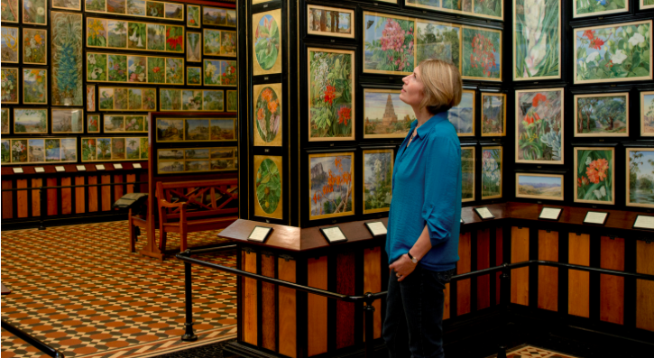
Marianne North was a remarkable Victorian artist with a great eye for botanical detail. In this extraordinary gallery, you can see 833 of her paintings displayed in geographical order, which she hung after traveling around the world.
The walls of the gallery are covered with almost all of Marianne North's botanical paintings.
After an exhibition in London in 1879, North had the idea of showing her paintings at Kew. She offered to build a gallery if Kew Director, Joseph Hooker, would agree to display her life’s work in it.
The gallery opened in 1882, built in a mix of classical and colonial styles. North had wanted tea and coffee served to visitors, however, Hooker declined her request. Instead, she painted a coffee plant over one entrance door and tea over the other.
References of research:
https://www.builddirect.com/blog/the-fascinating-history-of-the-living-room/
https://blogsurabhi.wordpress.com/2013/03/09/what-is-the-origin-of-the-term-living-room/
http://www.differencebetween.info/difference-between-living-room-and-drawing-room
https://wellcome.ac.uk/press-release/changes-london-taxi-drivers-brains-driven-acquiring-‘-knowledge-study-shows
https://www.alleydog.com/glossary/definition.php?term=Memory+Trace
https://www.merriam-webster.com/dictionary/memory%20trace
https://www.simplypsychology.org/forgetting.html
https://www.artsy.net/show/parafin-michelle-stuart-trace-memory-selected-works-1969-2015
https://www.artsy.net/gene/contemporary-traces-of-memory-1
https://www.geffrye-museum.org.uk
https://www.kew.org/kew-gardens/attractions/marianne-north-gallery
https://www.technologyreview.com/s/602558/tracing-a-memory/
Artist Statements
Artist statement that I like:
Hamburg, 1968, as quoted in “Artists on Their Art,” Art International 12, no.4 (20 April 1968): 55.
"I built up something by having disturbed something: destruction becomes construction. Action interrupts contemplation, as the means of accepting something among many given alternatives, for accepting nothing becomes chaos. A system became necessary: how else could I in a concentrated way find something of interest which lends itself to continuation? My systems are numerical concepts, which work in terms of progressions and/or reductions akin to musical themes with variations. In my work I try to expand and contract as far as possible between limits known and unknown. Generally, I couldn’t talk about limits I know. I only can say at times I feel closer to them, particularly while doing or after having done some conceptual series…. The most simple means for setting down my ideas and conceptions, numbers and words, are paper and pencil. I like the least pretentious and most humble means, for my ideas depend on themselves and not upon material; it is the very nature of ideas to be non-materialistic. Many variations exist in my work. There is consistent flexibility and changeability, evidencing the relentless flux of events."
Other 4 artist statements:
The Anti-artist-statement Statement
Posted: April 2, 2013 | Author: pensum | Filed under: 2010-, Uncategorized, USA | Tags: Hyperallergic, Iris Jaffe | 1 Comment
I hate artist statements. Really, I do.
As an artist, they are almost always awkward and painful to write, and as a viewer they are similarly painful and uninformative to read.
I also don’t know who decided that artists should be responsible for writing their own “artist statement.” Maybe it was an understaffed gallery in the 1980s, or a control freak think-inside-my-box-or-get-out MFA program director, but regardless of how this standardized practice came to be, the artist’s statement as professional prerequisite (at least for artists who have yet to be validated by the established art world) has long overstayed its welcome. And I don’t think a new one should be required in its place. (read)
by Iris Jaffe
from Hyperallergic
Christine Sun Kim: Listening with One’s Eyes
Posted: October 20, 2012 | Author: pensum | Filed under: 2010-, performance, Sculpture, sound, USA | Tags: Christine Sun Kim, deafness, sign language | 1 Comment
Considering the fact that I was born deaf, my learning process is shaped by American Sign Language interpreters, subtitles on television, written conversations on paper, emails, and text messages. These communication modes have often conveyed, filtered, and limited information, which naturally leads to a loss of content and a delay in communication. Thus, my understanding of reality is filtered, and potentially distorted. This is part of the core of my practice as an artist and I am now taking ownership of sounds after years of speech therapy. Instead of seeking for one’s approval to make “correct” sounds, I perform, vocalize, and/or visually translate them based on my perception.
As a visual and performance artist, it is always my intention to approach sound by constantly pushing it to a different level of physicality, and despite my complex relationship with Deaf culture, I attempt to translate sound while unlearning society’s views and etiquettes around it. Using my conceptual judgment and compromised understanding, I challenge and question its visual absence and sometime tactile presence. Fortunately, with today’s advanced technology such as computer programs and high bass speakers, I have been given alternative access to sound. It does not necessarily mean that it’s a mere substitute or replacement of sound.
Taryn Simon: White Tiger
Posted: May 6, 2012 | Author: geoffreyshea | Filed under: 2010-, Photography, USA | Tags: Taryn Simon | 1 Comment
White Tiger (Kenny)
Selective Inbreeding, Turpentine Creek Wildlife Refuge and Foundation
Eureka Springs, Arkansas
In the United States, all living white tigers are the result of selective inbreeding to artificially create the genetic conditions that lead to white fur, ice-blue eyes and a pink nose. Kenny was born to a breeder in Bentonville, Arkansas on February 3, 1999. As a result of inbreeding, Kenny is mentally retarded and has significant physical limitations. Due to his deep-set nose, he has difficulty breathing and closing his jaw, his teeth are severely malformed and he limps from abnormal bone structure in his forearms. The three other tigers in Kenny’s litter are not considered to be quality white tigers as they are yellow-coated, cross-eyed, and knock-kneed.
John McLaughlin: the marvelous void
Posted: October 1, 2011 | Author: pensum | Filed under: 1960-9, 1970-9, abstract, minimal, Painting, USA | Tags: John McLaughlin | Leave a comment
My purpose is to achieve the totally abstract. I want to communicate only to the extent that the painting will serve to induce or intensify the viewer’s natural desire for contemplation without the benefit of a guiding principle.
Pop Up with Elena:
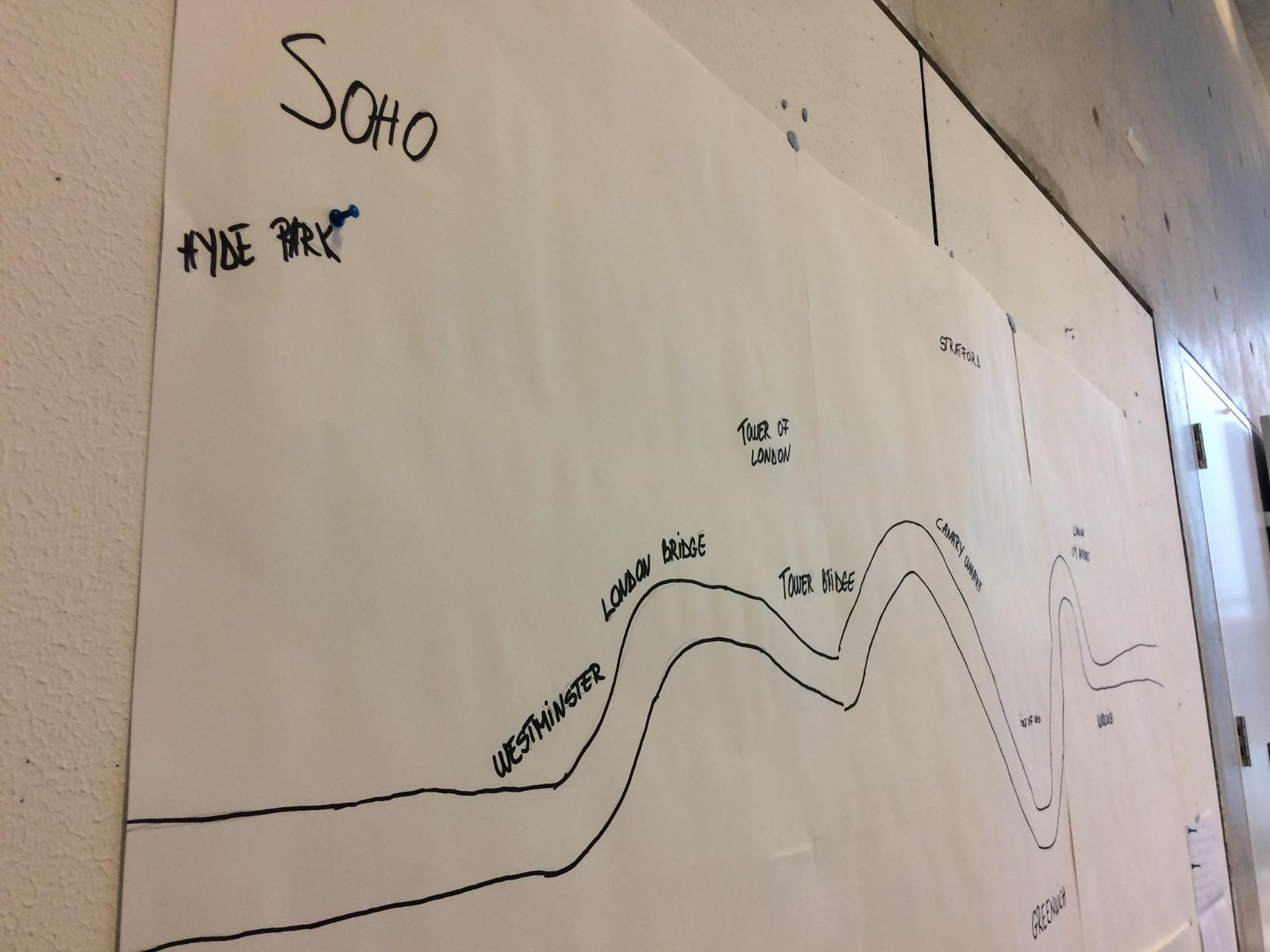
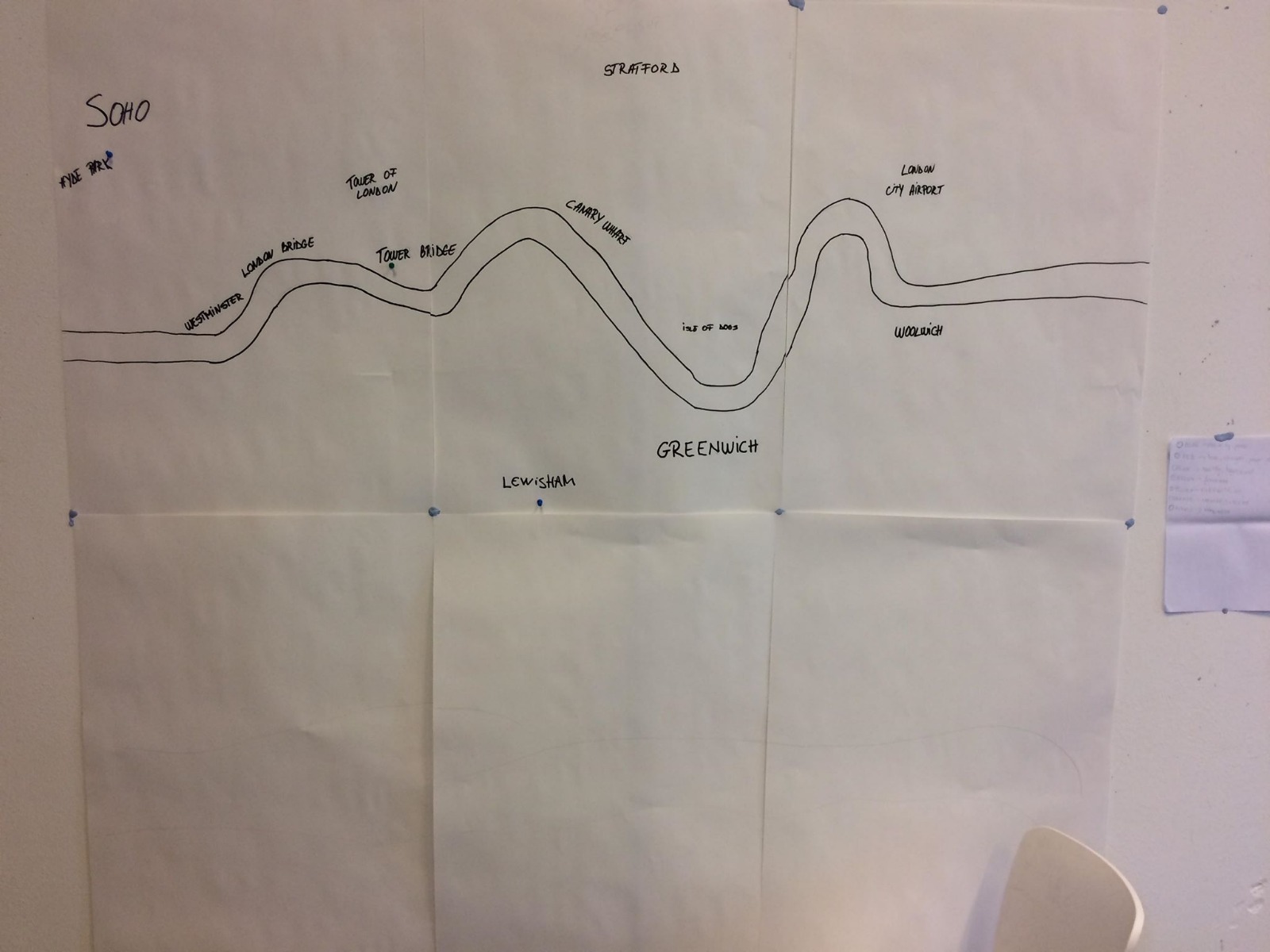
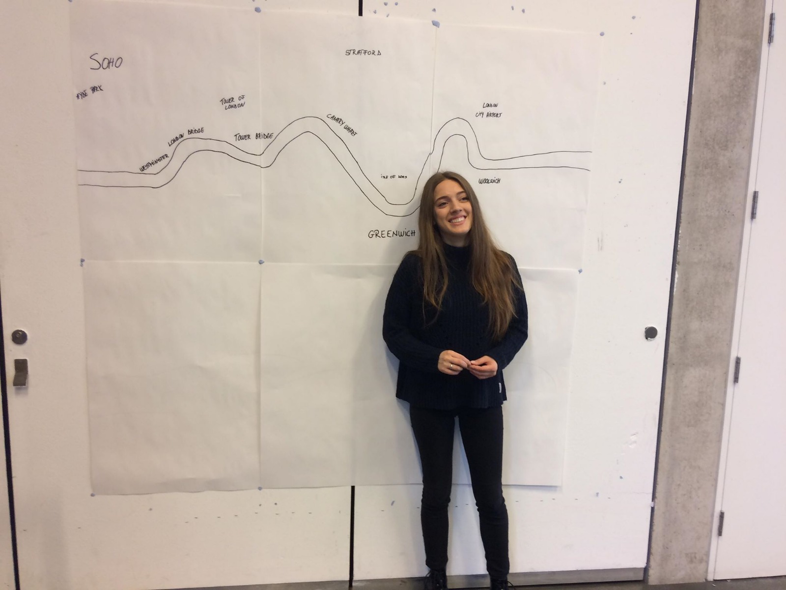
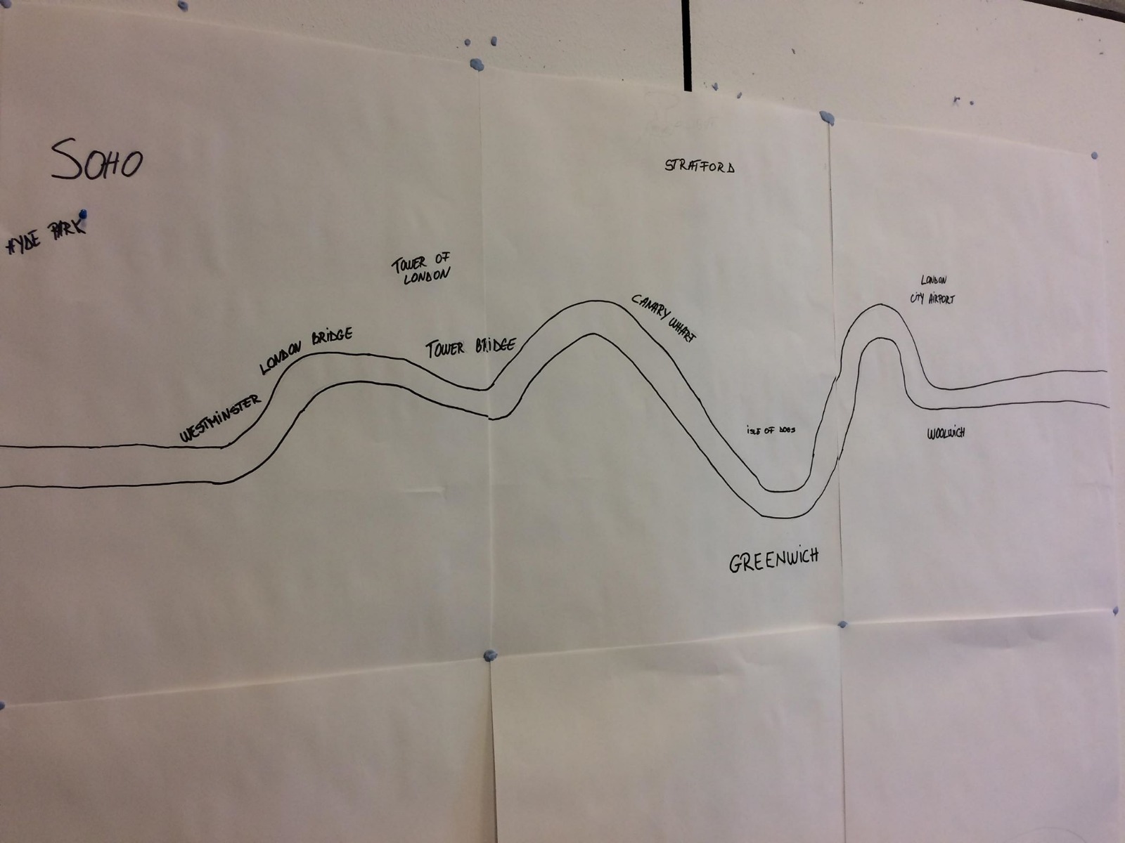
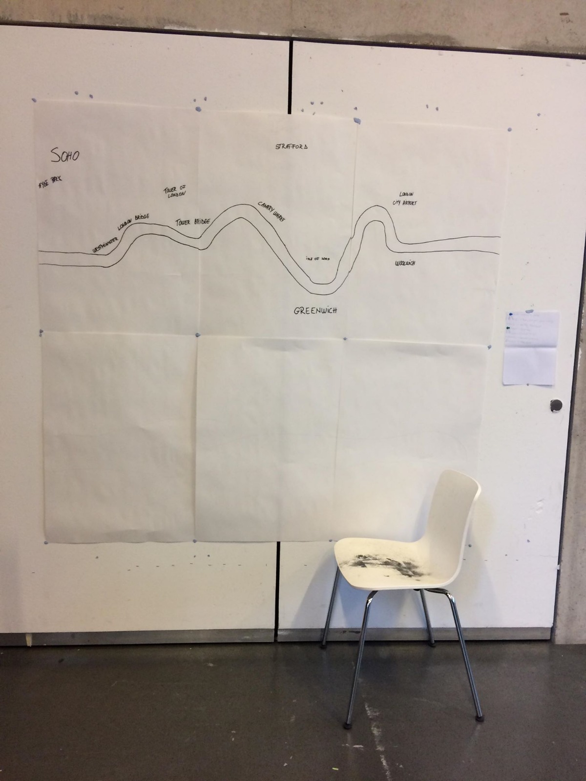
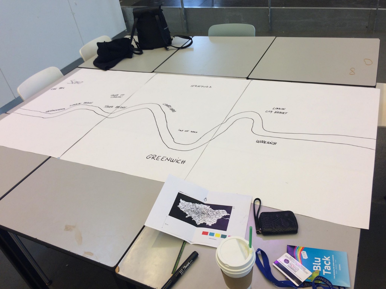
During our first out of two workshops with Elena we came up with our idea. When we first went we were unsure where to take our idea about psychogeography and what exactly we can do with it, but after few hours of brainstorming and research with came up with the idea to create an Interactive psychogeographic map of London. We took inspiration from the Theory of Derive, as well as a Ted talk done in Berlin called Happy Maps.
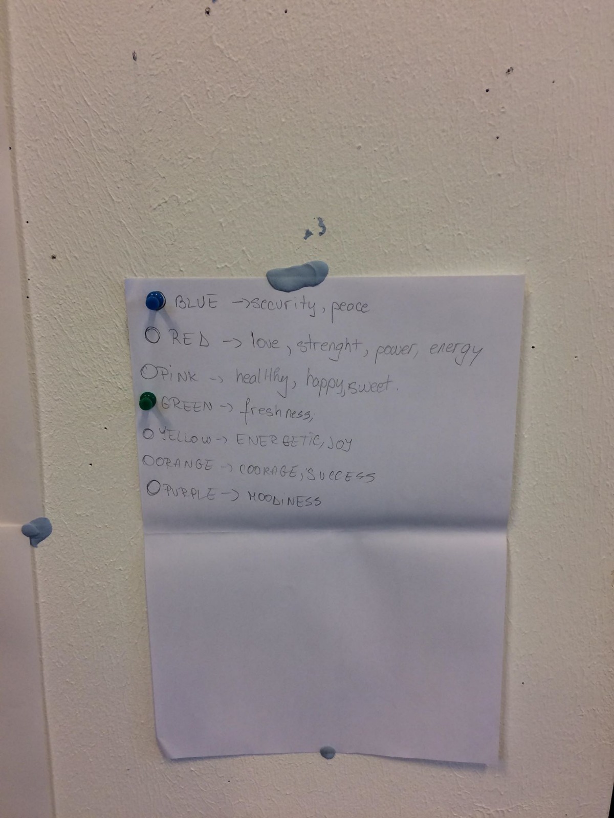
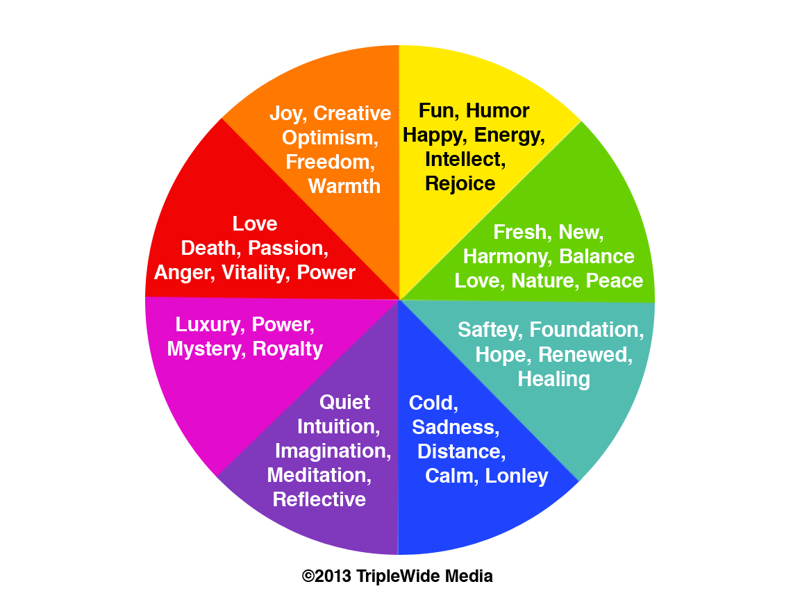
We decided that we will sketch out a map of London in black and white and provide colorful pins to the audience, with an explanation of what emotion each color means and ask them to place the relevant color pin to the location in London that has made them feel this particular way.
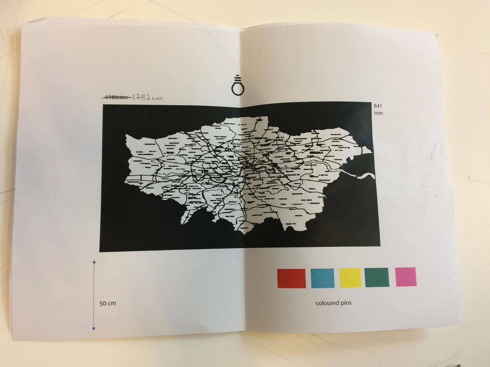
We started out with a sketch on an with measurements, firstly we decided that it will be A1. After that, once we started building the trial one we decided that it will have better impact and effect if we make it bigger so we altered it to be A0 in size instead.
During the pop-up show, we had a discussion with Elena and other members of the class. They said that it is a good idea and if they were a part of the exhibition they would find it interesting to take part in it, as interactive pieces are interesting to them.
Whilst we looked at the trial installment, we thought that we can add something more to make it even more interactive for anyone that finds it particularly interesting. We decided that we will provide small sheets of paper and pens, where they can add a description of the story or the emotion that this place is making them feel along with the pin.
The response to the rest of the class to that idea was positive and we were happy that there is a good chance the audience at the second year show might decide to participate.
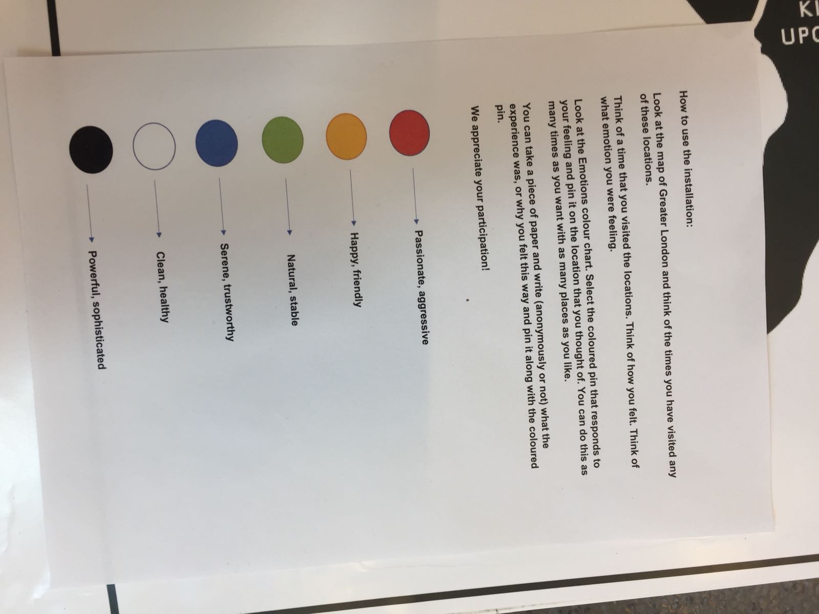
How to use the installation:
Look at the map of Greater London and think of the times you have visited any of these locations.
Think of a particular time that you visited the locations. Think of how you felt. Think of what emotion you were feeling.
Look at the Emotions color chart. Select the colored pin that responds to your feeling and pin it on the location that you thought of. You can do this as many times as you want with as many places as you like.
In case you want to share more, you can take a piece of paper and write (anonymously or not) what the experience was, or why you felt this way and pin it along with the colored pin.
We appreciate your participation!
Research
Happy Maps
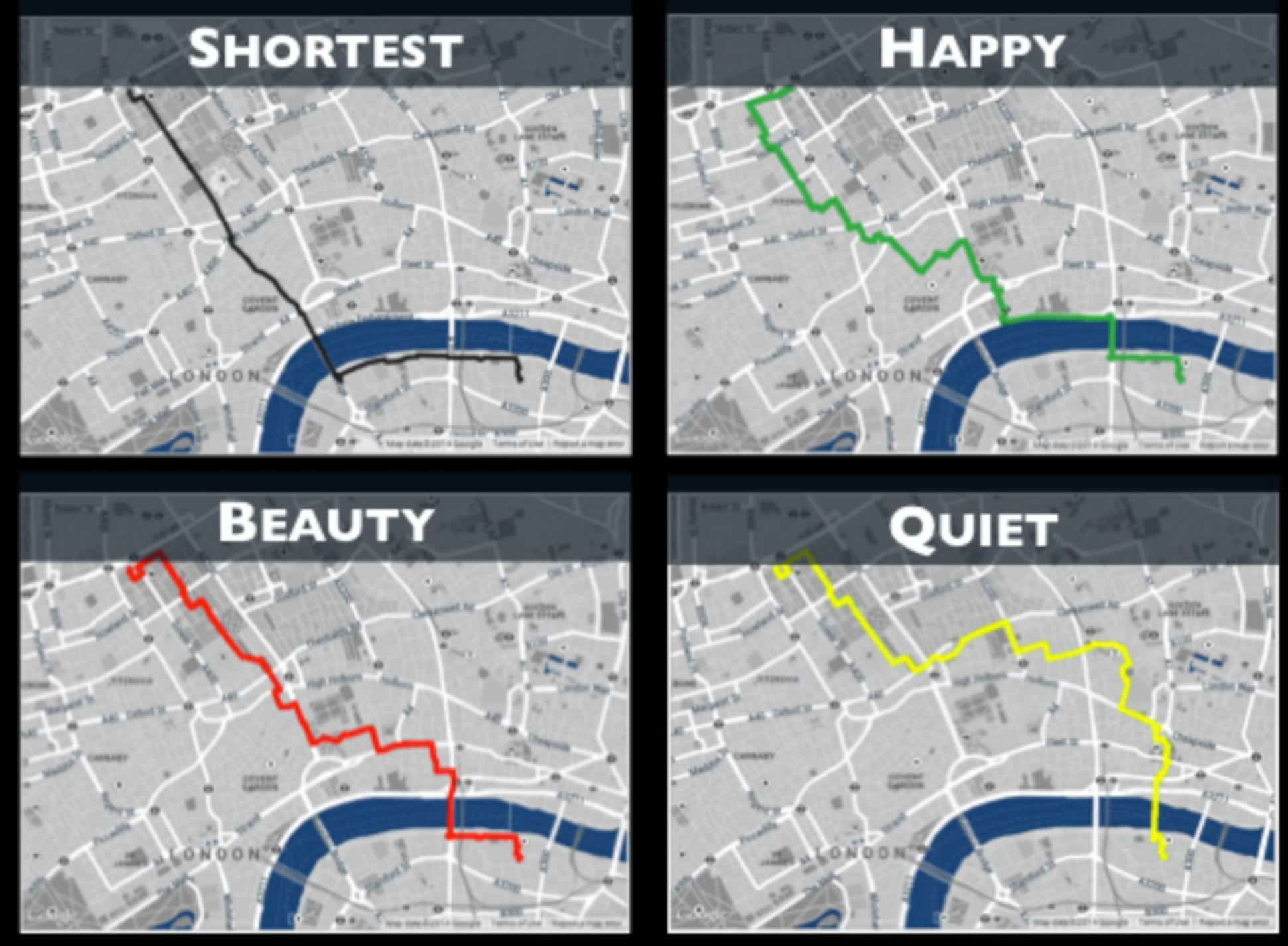
Out with cars and concrete buildings and in with public spaces and Victorian houses – that’s what researchers at Yahoo Labs would have us believe when it comes to navigating a city.
Based on the premise of how much we miss by taking the direct A to B route, the researchers want to improve digital maps by drawing together information on the fixtures and fittings of a city that make walkers feel good as they amble along.
It’s not about massive detours, as the main image hopefully shows, but about how much more could be experienced by taking a slightly different route.
The goal is a mapping application that presents the most enjoyable routes taking into account not only what looks appealing but also sounds, smells and even the memories people attach to a place.
How it inspired our project:
The interactive map that we are creating aims to show that certain places wake up emotions in us. It aims to show that maybe somebody took a certain route and that is why the feeling that they are pinning on the board emerged at that location. Maybe they decided to take a leafier sunnier route to the location and that's why they felt happy. Or maybe they took a different route than usual and witnessed something that makes them sad. It aims to show that maybe certain locations and routes wake up emotions in us, the way Happy Maps wants to show that people can feel happier if they take certain routes on their journey.
Theory of Derive
One of the basic situationist practices is the dérive,(1) a technique of rapid passage through varied ambiances. Dérives involve playful-constructive behavior and awareness of psychogeographical effects and are thus quite different from the classic notions of journey or stroll.
In a dérive, one or more persons during a certain period drop their relations, their work and leisure activities, and all their other usual motives for movement and action, and let themselves be drawn by the attractions of the terrain and the encounters they find there. Chance is a less important factor in this activity than one might think: from a dérive point of view cities have psychogeographical contours, with constant currents, fixed points, and vortexes that strongly discourage entry into or exit from certain zones.
But the dérive includes both this letting-go and its necessary contradiction: the domination of psychogeographical variations by the knowledge and calculation of their possibilities. In this latter regard, ecological science, despite the narrow social space to which it limits itself, provides psychogeography with abundant data.
The ecological analysis of the absolute or relative character of fissures in the urban network, of the role of microclimates, of distinct neighborhoods with no relation to administrative boundaries, and above all of the dominating action of centers of attraction, must be utilized and completed by psychogeographical methods. The objective passional terrain of the dérive must be defined in accordance both with its own logic and with its relations with social morphology.
In his study Paris et l’agglomération Parisienne (Bibliothèque de Sociologie Contemporaine, P.U.F., 1952) Chombart de Lauwe notes that “an urban neighborhood is determined not only by geographical and economic factors but also by the image that its inhabitants and those of other neighborhoods have of it.” In the same work, in order to illustrate “the narrowness of the real Paris in which each individual lives . . . within a geographical area whose radius is extremely small,” he diagrams all the movements made in the space of one year by a student living in the 16th Arrondissement. Her itinerary forms a small triangle with no significant deviations, the three apexes of which are the School of Political Sciences, her residence and that of her piano teacher.
Such data — examples of a modern poetry capable of provoking sharp emotional reactions (in this particular case, outrage at the fact that anyone’s life can be so pathetically limited) — or even Burgess’s theory of Chicago’s social activities as being distributed in distinct concentric zones, will undoubtedly prove useful in developing dérives.
How it inspired our project:
" from a dérive point of view cities have psychogeographical contours, with constant currents, fixed points, and vortexes that strongly discourage entry into or exit from certain zones." London is an enormous city, that is a home to millions of people. “the narrowness of the real Paris in which each individual lives . . . within a geographical area whose radius is extremely small,” We wanted to show that despite the fact that it is such a big city, that is a home to so many people maybe there are things that relate to a lot of them. We would want to examine the results of the interactive map - do various locations have a lot of the same color pins, meaning that they bring up the same emotion to a lot of people?
Drifting with The Situationist International, Author Unknown, from Smile #5
An example of a situation-creating technique is the dérive. The dérive is the first step toward an urban praxis. It is a stroll through the city by several people who are out to understand the "psychogeographical articulation of the modern city". The strollers attempt an interpretive reading of the city, an architectural understanding. They look at the city as a special instance of repressed desires. At the same time, they engage in "playful reconstructive behavior". Together they turn the city around. They see in the city unifying and empowering possibilities in place of the present fragmentation and pacification. This "turning around" or détournment is a key strategic concept of the Situationists. Détournment is a dialectical tool. It is an "insurrectional style" by which a past form is used to show its own inherent untruth-- an untruth masked by ideology. It can be applied to billboards, to written texts, to films, to cartoons, etc., as well as to city spaces. Marx used it when he "turned Hegel on his head." He used the dialectic in the study of history to expose the ideological nature of Hegel's idealism. The Situationists use détournment to demonstrate the scandalous poverty of everyday life despite the plenty of commodities. They attempted to demonstrate the contrast between what life presently is and what it could be. They wanted to rupture the spell of the ideology of our commodified consumer society so that our repressed desires of a more authentic nature could come forward. The situation is based on liberated desires rather than alienated ones. What these desires are cannot be stated a priori. They will emerge in the revolutionary process of situation-creation, of détournment. Presumably, communality, unification, and public urban space will emerge as more desirable than commodification, fragmentation, and privatization.
How it inspired our project:
"Détournment is a dialectical tool. It is an "insurrectional style" by which a past form is used to show its own inherent untruth-- an untruth masked by ideology. It can be applied to billboards, to written texts, to films, to cartoons, etc., as well as to city spaces. " However we wanted to show the truth about London and its city spaces. We wanted to explore that maybe despite the fact that it is called one of the greatest cities in the world, and that some locations are famous worldwide and dream destinations, maybe they bring up not so positive emotions? Maybe an unpopular location brings up a lot of positive emotions? What does London make its inhabitants feel? Would yellow (joyful) color be predominant or red (angry)? "The situation is based on liberated desires rather than alienated ones." We want people to be honest and share their emotions as they are, maybe emotions that they haven't thought of before that.
'The most radical gesture: The Situationist International in a postmodern age' by Sadie Plant and published by Routledge
"...The situationists' desire to become psychogeographers, with an understanding of the 'precise laws and specific effects of the geographical environment, consciously organized or not, on the emotions and behaviour of individuals', was intended to cultivate an awareness of the ways in which everyday life is presently conditioned and controlled, the ways in which this manipulation can be exposed and subverted, and the possibilities for chosen forms of constructed situations in the post-spectacular world. Only an awareness of the influences of the existing environment can encourage the critique of the present conditions of daily life, and yet it is precisely this concern with the environment which we live which is ignored."
How it inspired our project:
This is precisely what we wanted to understand and convey through our project. What are the effects of the geographical environments on people's emotions? Is there a pattern? Are the geographical environments our main causes for experiencing certain feelings? Or is it purely individual? This would be found out through examining the patterns after the show.
Reflection and Limitations
What worked well
Overall in preparation for the project and creating it, I think the fact that it was only two of us in the group, actually worked quite well because it was easier to manage. Sometimes when there are too many people, some people don't do as much work and others might feel that this is unfair. We managed to spread the workload equally so that it is easy to manage and we feel satisfied.
For the project itself, I think the idea of having it interactive has made it very successful. We got a feedback from people who took part, saying that it is so fun and that they find this very interesting and are looking forward to seeing the results of the piece after more participants have taken part. They were all smiles whilst they were choosing their pins and writing their notes. I think that this shows that one of the objectives of the project was fulfilled: it is fun for the audience, they enjoy taking part in it and find it interesting.
What did not work so well
The fact that we had to change our initial idea: A metallic board with magnetic pins and spotlight on top, as well as the scale (having it A1 instead of A0), due to the organizers of the show saying that this cannot be done, sacrificed somewhat the aesthetics of it. I do believe that had we been able to go through with our initial idea, we would have been able to achieve a more aesthetically pleasing final piece.
Furthermore, the quality of instructions given by the show organizers also did not help us at all. Had we known about these changes earlier we could have altered our project better.
Our initial idea was also to have it on film paper - acetate, however, due to our budget we were unable to do that.
How could it be improved
More interesting paper can be used with a bigger budget, I believe acetate would have given it a very sleek effect.
Better communication from the organizers will let alter our project better to fit their requirements.
A more detailed map would look good on a bigger scale project, however, on A1 this map worked well as it is easy to read.
There is more that can be done in future: maybe participants can be able to track their favorite routes or the one that they take most often or the ones that they hate.
Overall:
Overall I think the project was a success. Although there were some changes that we had to made that did not fit our initial idea, we still manage to make it work and create something interesting for the audience.
We enjoyed creating it and we hope that the audience enjoys it just as much.
References:
http://www.bopsecrets.org/SI/2.derive.htm
https://www.tnooz.com/article/happy-maps-yahoo-labs/
http://asketchofparis.blogspot.co.uk/2012/06/summary-of-guy-debord-theory-of-derive.html
https://www.creativebloq.com/web-design/12-colours-and-emotions-they-evoke-61515112
https://corinacaduff.ch/wp-content/uploads/2011/06/Artistic-Research1.pdf
http://carolegray.net/Papers%20PDFs/cc.pdf
https://www.ncrm.ac.uk/news/show.php?article=5465
https://www.sensepublishers.com/media/2174-a-practical-guide-to-arts-related-research.pdf
Visual Research and Visual inspirations
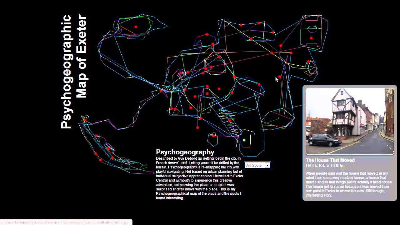
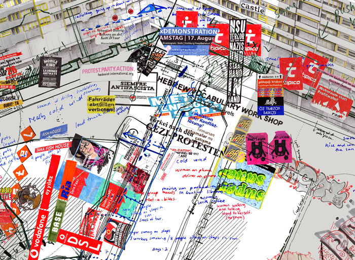
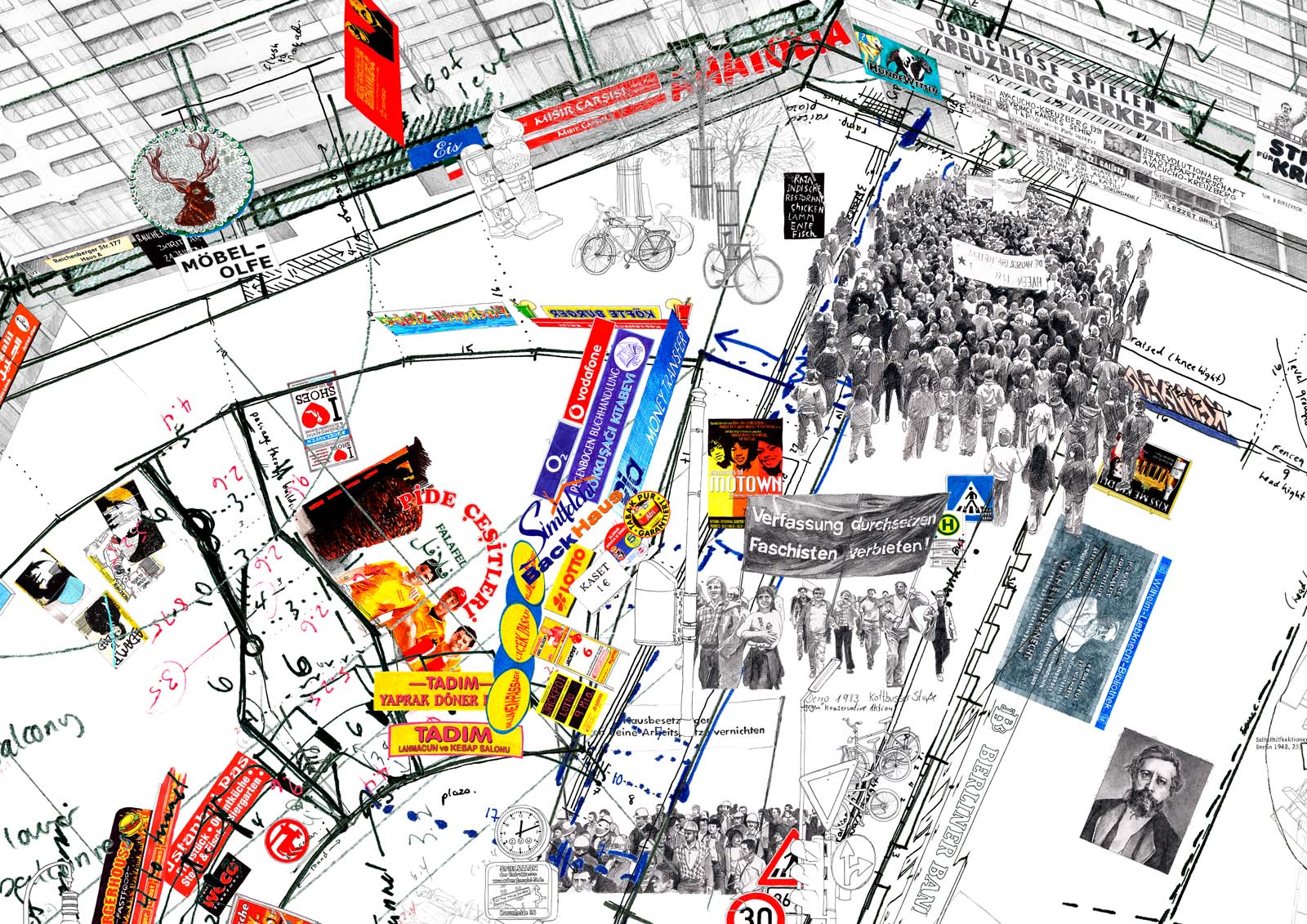
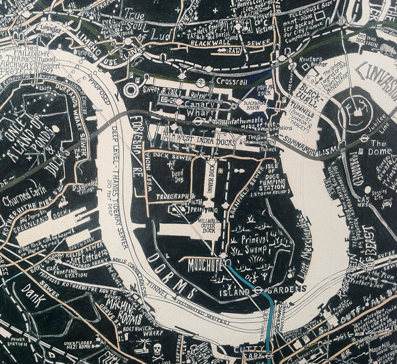

Initial design plan:
Metalic magnetic board size A0
A simple map of London drawn with black ink
Magnetic colorful pins
Altered design plan:
We received an email from the course leader that we should instead use a foam board. We, therefore, purchased foam boards 4xA2 which will tile to create A0 format, as there were no A0 foam boards that could be delivered without being damaged.
Due to the nature of the material (foam), we decided to print instead of drawing and attach it to the foam boards.
We printed a simple black and white map of London. We did not want an overwhelmingly detailed map, with funky fonts or anything like that as we wanted the colors of the emotion wheel to be the thing that stands out the most. We decided on black and white as the colors will contrast well with it.
We purchased regular pins instead of magnetic ones that can be easily put on the foam board.
We printed on premium glossy photo paper to achieve the closest effect to the desired one.
Initially, we wanted to print on acetate paper, however, unfortunately, the cost of this was out of our budget and we could not afford it. Premium glossy photo paper was the closest thing to it within our budget range.
We purchased a box to store the colorful pins in as well as one for the paper tags that people can use if they want to add a story to their pins.
Materials used:
4 x A2 foam boards
1 x A0 print on premium glossy photo paper
170 x colorful pins
2 x boxes for storage
1 x explanation paper
Altered project:
2x A2 foam boards
1x A1 print on premium glossy photo paper
1 x Pen
3 x rolls of double-sided tape
2 x nails and 1 x hammer
Emotion color chart for the project:
RED: Passionate, aggressive
YELLOW: Happy, friendly
GREEN: Natural, stable
BLUE: Serene, trustworthy
WHITE: Clean, healthy
BLACK: Powerful, sophisticated
RESEARCH QUESTION:
WHAT EMOTIONS ARE BROUGHT UP BY LOCATIONS DEPENDING ON PEOPLE'S OWN EXPERIENCES?
PROJECT NAME
LONDON FEELINGS
Exploring research methods
The discourse of artistic research emerged, in the 1990s, in An-
glophone countries and Scandinavia, initially e abolished in Visual Arts departments of art schools. Today it has also reached the fields of design, theatre, lm, music and dance. The fact that artistic research unites so many different artistic disciplines under the roof of one discourse is a great achievement. Only literature/ ion is not included. The reason why authors are not able to partake in the discourse on artistic research may be because the subject Creative Writing is e abolished not in art schools but in universities – in Anglophone countries traditionally in the English Language departments.
The list should be shared here—as a pointer toward the really beneficial reasons to be cheerful. Any knowledge must be lead by the following:
! Organization
! Stability
! Coherence
! Economy of expression
! Logical consistency
Contextualization is also another name for giving content to concepts, for the actualization of preexisting frameworks and notions. How are particular concepts—say, for example, “body”—understood and actualized in this particular research? Through this kind of work, we slide seamlessly into interpretation and imagination.
The starting point, the inside from which everything starts and to which everything returns, is the contextualized practice
Mixed methods is perhaps the most well established area, with dedicated books and journals. But the potential – and the risks – of mixing methods are still not understood by most researchers. People often think in terms of gathering data using both quantitative and qualitative methods, but there is so much more scope for mixing, from using different theoretical perspectives to inform the same piece of research to multi-media presentation and dissemination.
"Arts-based methods include visual and performative arts, creative writing, music, textile arts and crafts – pretty much any art form can be used in the service of research. In fact, the arts and research are closely linked, as artists of all kinds use research in support of their work. And arts-based methods, like all creative methods, apply to both quantitative and qualitative research. One of my favourite examples is that of a mathematician researching hyperbolic geometry, i.e. the geometry of frilly things like lettuce and jellyfish. Male mathematicians had tried and failed to model this for centuries, and it wasn’t until the American mathematician Daina Taimina was musing on the problem while crafting that she realised it could be done using crochet. I recommend her TED talk."
The research is guided by a moral commitment — For researchers in this field the work produced is expected to, as it were, “take a stand.” Research and the related artifacts may, and often do, present and promote personal transformation both for the artist-researcher and the viewer.
Knowledge is generated through the work — It is not always initially clear to the artist/researcher in what ways knowledge might be generated. It might be in terms of what the work evokes for others or it might present a socio-cultural change to those who encounter the work. At other times knowledge might be generated by the artist/researcher for themselves through the work they are creating.
Accessibility is a firm focal point — A central stance in arts-based research is that the work does not only have the potential to challenge and transform but also that it is available and accessible to a wide and diverse audience. Such accessibility means not just that an audience can see or read the work but also that they can understand, engage and relate to it.
There is a sense of authenticity — The work and research must be intertwined and mutually shaping so there is sense of integrity about the art and the research. This is perhaps the most central feature of arts-based research, which is related to the idea of trustworthiness or plausibility in other forms of qualitative inquiry. This aspect is essential so that there is consistency and rigour characterizing the relationship between the research and the artwork.
Project description
"London Feelings" is an interactive map of London, which shows the different emotions people feel on different Locations around London. The audience looks at the emotion color chart and responds by placing the colorful pin responding to their emotions on the given location that they are thinking of. We wanted to show that despite the fact that it is such a big city, that is a home to so many people maybe there are things that relate to a lot of them. We would want to examine the results of the interactive map - do various locations have a lot of the same color pins, meaning that they bring up the same emotion to a lot of people? The Theory of Derive was the main focal point for the project and the biggest inspiration, it was drawn from Guy Debord. The installation looks at several questions that can be answered through the audience participation: What are the effects of the geographical environments on people's emotions? Is there a pattern? Are the geographical environments our main causes for experiencing certain feelings? Or is it purely individual?
Artistic statement
Looking for a way to read the city, we created work that deals with the documentation of feelings and emotions through visual presentation. By studying psychogeography and the study of color meaning we created an interactive piece, that aims to understand how different locations in the city have an effect on people's emotions. The piece "London feelings" responds to the surrounding environment and uses daily experiences from the audience to draw on a better understanding of the city. We focused on the notion of 'the public space' and an understanding of the city emotion that can only be understood through an interactive installation. With the Theory of Derive in mind, we wanted the audience to experience a playful-constructive behavior and become aware of their psychogeographic experiences in the city that they might not have been aware of before. We wanted the audience to expose their bare feelings about the city without holding back. We wanted emotions to become images and the images to become language. Language that speaks about the city in a way that has not been spoken before. The basic structure was meant to seem incomplete, the audience was going to be the final artist of the piece that we created.
10/5/2018 THE DAY BEFORE THE FINAL SHOW
PUTTING EVERYTHING TOGETHER
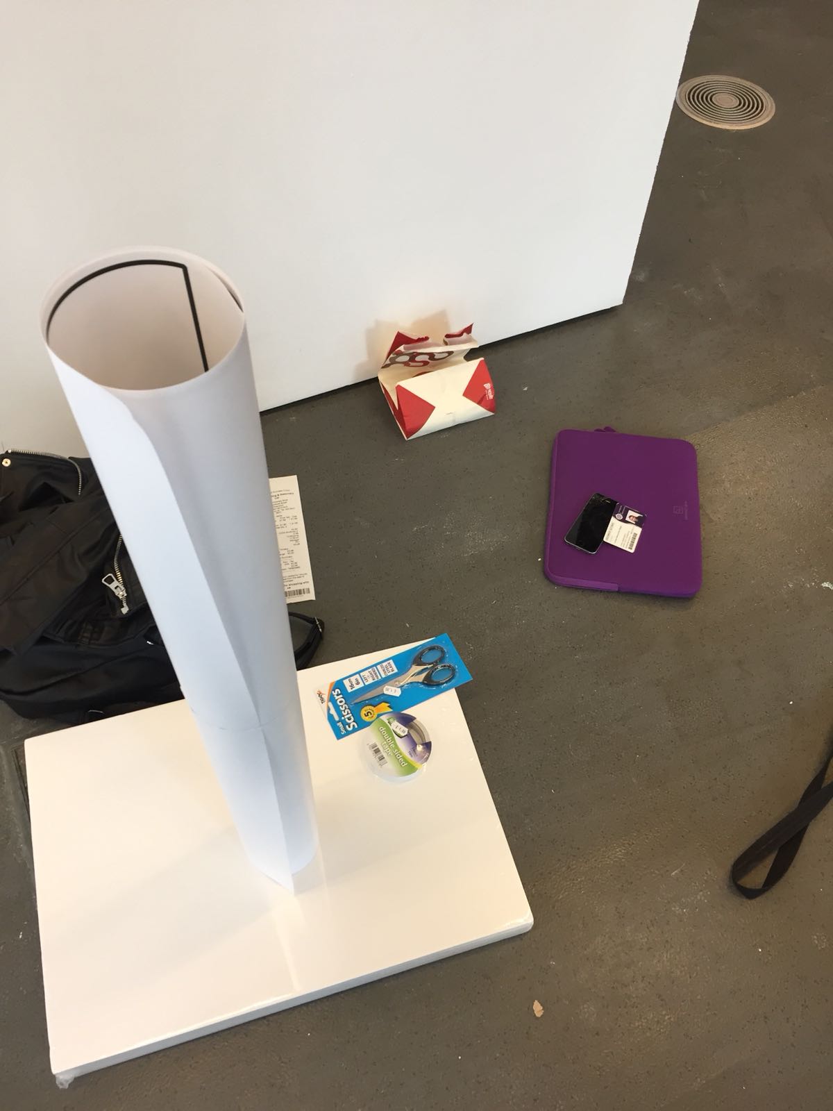
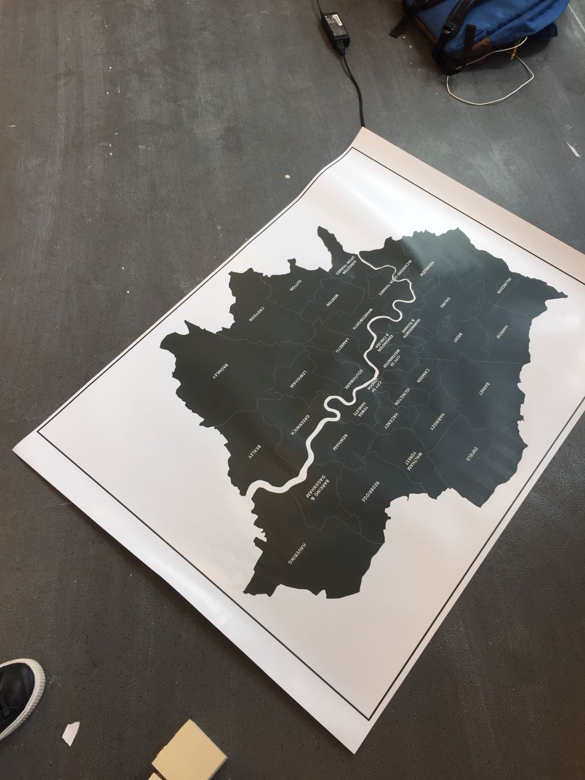
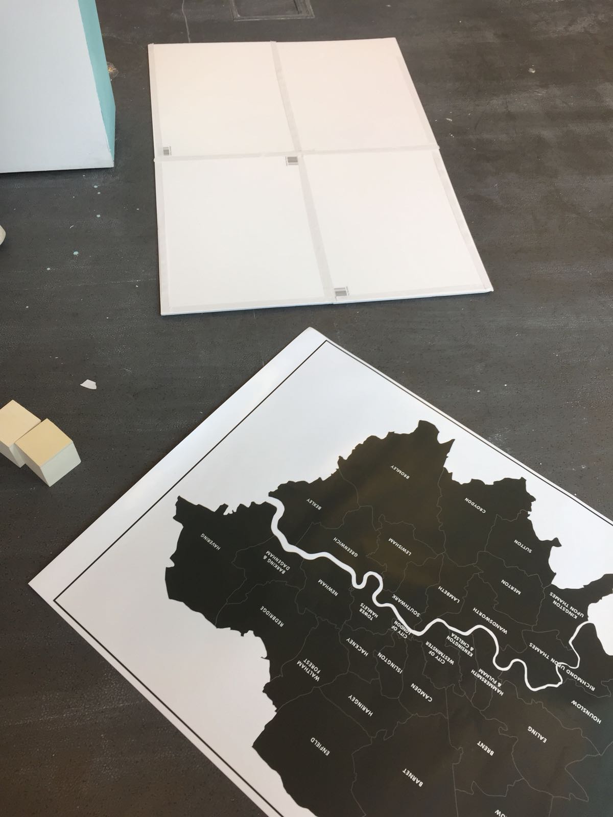
10/05/18
HOW IT WENT, AND WHY WE HAD TO ALTER OUR PROJECT
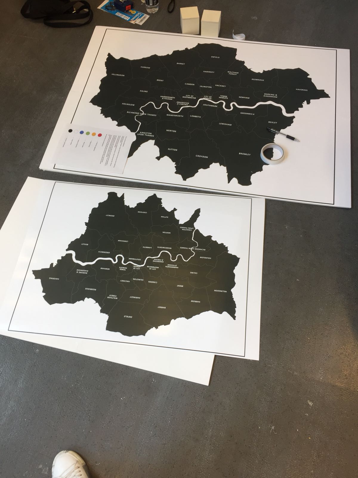
Today we came at 11 o'clock to put everything together.
We gathered all our final materials, we met with the course leader: Olivia and we started putting the map together.
After we put it together: the 4x A2 foam boards, which created one A0 board with the map on it, we were told that we are not allowed to have A0, as A1 is the maximum side, despite the fact that we sent an email with the exact measurements and nobody made us aware of this fact.
We felt discouraged and a bit upset as we had already put a lot of effort into creating the A0 board, and we already spent quite a bit of money for it. Despite that fact, we did re-do it:
2x A2 foam boards instead of 4 and printed it on A1 paper. This did stretch our budget more than we had anticipated for so we are hoping that in future people will be made aware of how much space they are allowed.
THE PROCESS:
Despite this the process was enjoyable. The hardest bit was gluing it together as we wanted it to be perfect. Also putting it perfectly straight on the wall.
First, we put it on the wall with double-sided tape. It looked well and it worked well at first, but after some of the audience took part in it and they put their pins it fell. Then we asked the organizers to put two nails on the top sides, under the paper for aesthetic reasons. We were happy that we will be sure it won't fall during the final show.
THE FINAL LOOK